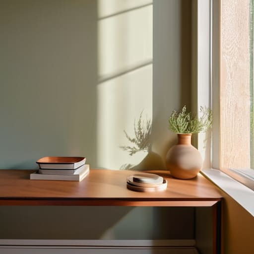
I remember standing in the middle of my first tiny apartment in San Francisco, surrounded by dozens of tiny, confusing paint swatches that felt more like a math exam than a creative choice. I had spent hours scrolling through endless Pinterest boards, feeling completely paralyzed by the fear that one wrong shade of “eggshell” would ruin my entire sense of peace. We’ve been told that figuring out how to choose paint colours requires an expensive designer or a degree in color theory, but honestly? That’s just noise that keeps us from actually living in our spaces.
I’m not here to give you a list of the “trendiest” shades that will feel dated by next summer. Instead, I want to show you how to approach your walls through the lens of emotional well-being and intentionality. We are going to strip away the overwhelm and focus on how light, shadow, and your own internal rhythm dictate the perfect hue for your sanctuary. By the end of this, you won’t just have a color on a wall; you’ll have a space that finally allows you to pause and breathe.
Table of Contents
Finding Harmony Through Color Theory for Interiors
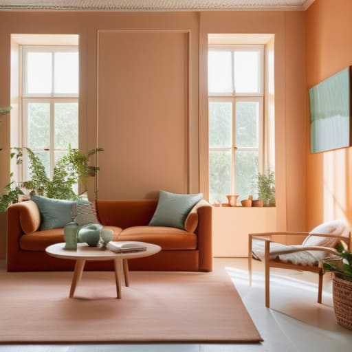
When I was working in the corporate world, my office walls were a sterile, soul-crushing beige. I didn’t realize then that the environment I inhabited was silently draining my energy. This is where the magic of color theory for interiors comes into play; it’s not just about aesthetics, but about how specific frequencies of light influence our nervous systems. When you’re deciding between warm vs cool paint tones, I want you to ask yourself: do I want this room to feel like a cozy embrace or a crisp, refreshing breath of air?
Understanding the emotional weight of your choices is vital, but we can’t ignore the physical reality of your space. I always tell my clients that you must observe how lighting affects paint color before making a final commitment. A shade that looks like a calming sage in the morning sun might transform into a moody, almost murky forest green once the sun dips below the horizon. Never underestimate the impact of natural light on walls; it is the silent partner in your design journey, dancing with your chosen hues from dawn until dusk.
Balancing Warm vs Cool Paint Tones for Peace
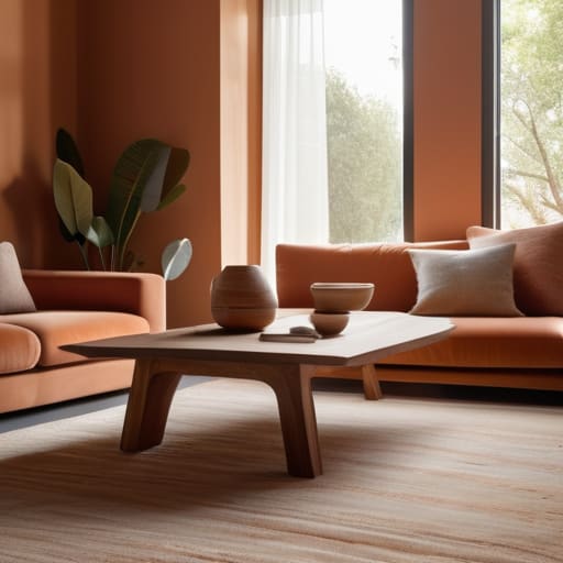
When we talk about the emotional temperature of a home, we’re really talking about how we want to feel the moment we cross the threshold. I remember back when I was working those grueling hours in corporate consulting, I used to come home to a living room painted in a stark, icy blue. I thought it would be calming, but it actually felt clinical and lonely—the exact opposite of the sanctuary I needed. Understanding the nuances of warm vs cool paint tones is less about following design rules and more about honoring your emotional needs. Warm tones, like soft terracottas or buttery creams, act like a gentle hug, making a space feel grounded and social.
On the other hand, cool tones—think sage greens or misty lavenders—can offer a sense of spaciousness and clarity, perfect for a dedicated meditation nook or a quiet study. However, there is a catch: you must consider how lighting affects paint color before you commit. A cool grey that looks sophisticated in a showroom might turn a depressing slate in a room with little sun. I always suggest observing your space at different hours; a color that feels “peaceful” at noon might feel “cold” by twilight.
Five Soulful Steps to Finding Your Perfect Hue
- Test your samples at different times of the day. I remember back in my corporate days, I once picked a calming sage for my home office, only to realize at 4 PM that the harsh sunlight turned it into a jarring neon green. Light is a living thing; watch how your chosen color breathes as the sun moves across your room.
- Don’t forget the “emotional temperature” of the room. Before you grab a swatch, sit in the space and ask yourself: “How do I want to feel when I walk in here?” If you need a sanctuary for deep rest, lean toward soft, muted tones; if you need a spark of creativity, look for colors that feel like a gentle nudge of energy.
- Use the 60-30-10 rule to prevent sensory overwhelm. To keep your space feeling balanced rather than chaotic, aim for 60% of a dominant color, 30% of a secondary color, and just a 10% pop of an accent. It’s much like a well-balanced meal—too much of one ingredient can drown out the subtle, beautiful notes.
- Look beyond the tiny paper swatches. I always tell my clients to buy a sample can and actually paint a large section of the wall. A tiny square on a piece of cardstock can be incredibly deceiving once it’s spread across a whole expanse of drywall. You need to see the color in its true habitat.
- Connect your palette to the natural world outside your window. There is something deeply grounding about a home that feels like an extension of its environment. If you have a view of lush trees, bringing in earthy terracottas or soft mossy greens can create a seamless flow that tells your nervous system it’s safe to relax.
Bringing the Essence of Your Space to Life
Remember that color is more than just a visual choice; it’s an emotional one. Before you commit to a swatch, sit in the room during different times of the day to see how the light shifts the mood, ensuring the hue truly resonates with your inner peace.
Don’t feel pressured to follow every design trend you see on social media. The most harmonious homes are built on personal intention—choose tones that reflect how you want to feel when you walk through the door, whether that’s energized for a morning flow or cocooned in calm for a restful evening.
Think of your color palette as a tool for mindfulness. By intentionally selecting shades that balance your energy, you aren’t just decorating a room; you are curating a sanctuary that supports your mental well-being and invites you to breathe a little deeper.
The Soul of the Space
“Choosing a color isn’t just about matching your furniture or following a trend; it’s about deciding how you want to feel the moment you step through the door. Ask yourself: does this shade invite me to exhale, or does it demand I stay on high alert?”
Sophia Reynolds
The Final Brushstroke
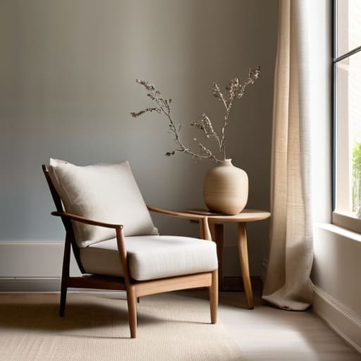
As we wrap up this journey through the spectrum of color, I hope you feel a little more grounded in your decision-making. Remember, choosing the right shade isn’t just about following design trends or matching your furniture; it’s about understanding how color theory can create a sense of intentional harmony in your home. We’ve explored how to balance those warm and cool tones to foster peace, and how to use the psychology of color to influence your daily mood. Whether you gravitate toward the grounding energy of earthy neutrals or the quiet sanctuary of soft blues, the goal is to ensure your walls reflect the inner stillness you are striving to cultivate every single day.
At the end of the day, your home should be a soft place to land—a physical manifestation of your well-being. Don’t feel pressured to get it “perfect” on the first try; your space is a living, breathing entity that will evolve alongside you. If a color feels slightly off, remember that you can always shift, layer, and rediscover. Trust your intuition and listen to what your soul needs from the space around you. You aren’t just painting a room; you are curating an environment that invites you to pause, breathe, and truly live. You’ve got this, and I can’t wait to see the sanctuary you create.
Frequently Asked Questions
How do I handle the shift in light throughout the day so my chosen color doesn't feel completely different by sunset?
This is such a common struggle! I remember painting my first apartment and feeling totally betrayed when my “calming sage” turned into a “moody forest” by 5 PM. To master this, I always suggest grabbing a few samples and painting large swatches on different walls. Observe them at noon, golden hour, and under lamplight. It’s about seeing how the light dances with the pigment, ensuring your sanctuary remains a sanctuary, no matter the hour.
Is it better to go with a bold, expressive shade for a small nook, or should I stick to more neutral tones to keep my space feeling calm?
Honestly, I’m a huge advocate for the bold approach in those little corners! Think of a small nook as a “sensory sanctuary.” While neutrals are lovely for expansive living areas, a deep, expressive shade in a tiny space can actually create a sense of cozy intimacy rather than clutter. It’s like a visual deep breath. Just ensure the color resonates with the mood you want to cultivate when you retreat there to reflect.
How can I test these colors in my actual home without feeling overwhelmed by a dozen different tiny paint swatches?
I completely hear you—staring at a sea of tiny paper swatches can feel more chaotic than calming! Instead of those miniatures, I love using large-scale peel-and-stick samples. They allow you to move the color around the room as the light shifts from morning to dusk. It’s like a mini-meditation for your space; you can truly sit with a shade and see how it breathes with your life before committing.