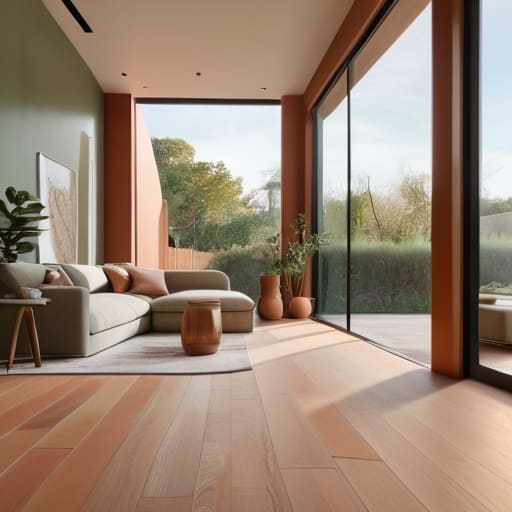
I still remember standing in the middle of my first tiny apartment in San Francisco, surrounded by dozens of tiny, confusing paint swatches that all seemed to look exactly the same under the flickering fluorescent lights. I felt completely paralyzed, convinced that picking the “wrong” shade would somehow ruin my ability to ever feel at peace in my own space. We’ve been conditioned to believe that learning how to choose a colour palette for a house has to be this high-stakes, expensive design ordeal involving mood boards and professional consultants, but honestly? That’s just noise.
I’m not here to give you a list of whatever shade is currently trending on Pinterest or tell you to follow rigid, soul-crushing rules. Instead, I want to help you tap into the intersection of color psychology and your own personal rhythm. I promise to share a practical, evidence-based approach that focuses on how light, emotion, and intention work together. We are going to find a palette that doesn’t just look beautiful in a magazine, but actually allows you to breathe the moment you walk through your front door.
Table of Contents
- Listening to Light the Impact of Natural Lighting on Paint Colours
- The Soul of Space Mastering Warm vs Cool Undertones in Home Decor
- Nurturing Your Space: 5 Intentional Steps to Finding Your Home's True Colors
- Finding Your Home's Inner Harmony
- Finding Your Home's Heartbeat
- Creating Your Sanctuary
- Frequently Asked Questions
Listening to Light the Impact of Natural Lighting on Paint Colours
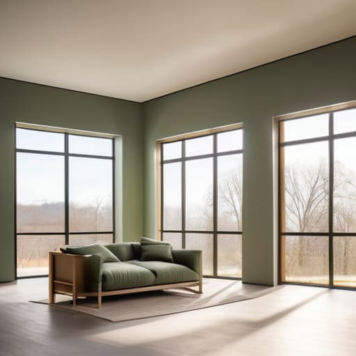
I remember sitting in my first studio apartment in San Francisco, staring at a “calming” sage green paint sample that looked absolutely beautiful in the store, only to have it turn into a muddy, depressing grey the moment the afternoon sun hit it. It was a humbling lesson in how much the sun dictates our mood. When we talk about the impact of natural lighting on paint colours, we aren’t just talking about visibility; we are talking about the energy of the room. A north-facing room, which tends to receive a cooler, more consistent light, can make certain shades feel chilly or even lifeless if you aren’t careful.
To find your home’s rhythm, you have to observe how the light dances across your walls at different hours of the day. This is where understanding warm vs cool undertones in home decor becomes your best friend. If you have a sun-drenched living room, a warm terracotta might feel incredibly cozy, whereas in a darker space, it might feel heavy. I always suggest grabbing a few samples and watching them transform from sunrise to sunset; it’s about finding a shade that feels like a gentle embrace rather than a sudden shock to your senses.
The Soul of Space Mastering Warm vs Cool Undertones in Home Decor
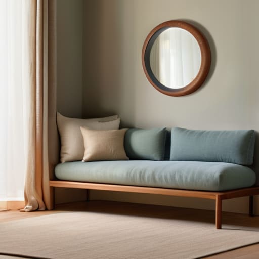
When we dive into the heart of a home, we aren’t just picking colors; we are setting an emotional frequency. This is where understanding warm vs cool undertones in home decor becomes a bit of a spiritual practice. I remember when I first moved into my apartment in San Francisco, I chose a stunning slate grey that looked sophisticated in the store, but once it was on my walls, it felt strangely clinical and lonely. I hadn’t accounted for the undertones. Warm undertones—think soft sands, terracottas, and creamy yellows—tend to embrace us, making a room feel like a cozy hug. Cool undertones, like crisp blues or misty greens, offer a sense of clarity and calm, perfect for those spaces where you need to find your center.
The trick to avoiding that “clashing” feeling is to look at how these temperatures interact as you move through your home. Mastering creating cohesive room transitions means ensuring that as you walk from a sunny kitchen into a quiet study, the shift in temperature feels intentional rather than jarring. It’s about finding a rhythmic flow that guides your energy from one space to the next, allowing your home to breathe alongside you.
Nurturing Your Space: 5 Intentional Steps to Finding Your Home's True Colors
- Start with your “anchor” pieces. Before you dive into a sea of paint swatches, look at the things that already bring you peace—maybe it’s a worn-in velvet armchair or a piece of art from your travels. Let these soulful objects act as your North Star, helping you build a palette that feels like a natural extension of your life rather than a sudden disruption.
- Curate an emotional mood board. Instead of just looking at pretty rooms on Pinterest, ask yourself, “How do I want to feel when I walk through this door?” If you need a sanctuary for decompression after a high-octane corporate day, lean into grounding earth tones; if you want a space that sparks morning creativity, invite in soft, energizing hues.
- Embrace the 60-30-10 rule for visual harmony. To prevent your home from feeling chaotic, try to balance your colors like you would balance your daily schedule. Aim for 60% a dominant neutral, 30% a secondary supporting color, and 10% a bold accent. It’s all about creating a rhythmic flow that allows the eye—and the mind—to rest.
- Test your colors through the lens of time. I can’t stress this enough: a color that looks divine in the bright midday sun might feel heavy or even a bit melancholy once the evening shadows creep in. Always paint large samples on different walls and check them at different hours; your home should support you through every phase of the day, from sunrise to sunset.
- Don’t fear the “white space.” In my years of consulting, I’ve seen so many people feel pressured to color every single inch of their lives. Remember that negative space—the breathing room between colors—is just as vital as the pigment itself. A well-placed neutral area gives your eyes a place to land and prevents your environment from feeling overstimulating.
Finding Your Home's Inner Harmony
Before you commit to a single swatch, observe how the light dances through your rooms at different times of day; your palette should breathe with the natural rhythm of your home.
Don’t just choose colors that look good on a screen—ask yourself how they feel against your skin and your spirit, opting for undertones that support the emotional sanctuary you’re trying to build.
Remember that a cohesive home isn’t about matching everything perfectly, but about creating a gentle flow that allows your mind to settle and your soul to feel truly at rest.
Finding Your Home's Heartbeat
“Choosing a color palette isn’t just about following a trend or matching your furniture; it’s about curating a sensory sanctuary that honors how you want to feel the moment you step through the door. When we select colors that resonate with our inner rhythm, our homes stop being just spaces and start becoming the breath of fresh air our souls truly crave.”
Sophia Reynolds
Creating Your Sanctuary
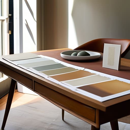
As we wrap up this journey of color and light, remember that choosing a palette is so much more than just picking pretty swatches from a catalog. We’ve explored how the shifting dance of natural light can transform a hue from vibrant to muted, and how understanding the delicate balance between warm and cool undertones can completely shift the emotional frequency of a room. It’s about more than just aesthetics; it’s about intentionality. When you align your color choices with the way your space breathes and how you move through it, you aren’t just decorating—you are curating an environment that supports your well-being.
At the end of the day, your home should be a soft place to land after a long, demanding day in the world. Don’t let the fear of making a “wrong” choice paralyze you; colors can be layered, adjusted, and even repainted as you grow and evolve. Trust your intuition and listen to that quiet inner voice that tells you a certain shade feels like a deep exhale. I truly believe that when we design our surroundings with mindfulness and love, we create a sacred sanctuary that allows us to truly flourish. Now, take a deep breath, grab those samples, and let your home reflect the beautiful harmony you deserve.
Frequently Asked Questions
How can I pick colors that make a small, cramped room feel more open and airy without it feeling cold?
I totally get that feeling—when a room feels like it’s closing in on you, it can really impact your headspace. To open things up without losing that cozy warmth, try leaning into “soft neutrals.” Instead of a stark, clinical white, reach for creamy off-whites or very pale sands. These reflect light to create space but keep a gentle, inviting glow. It’s all about finding that sweet spot where your walls breathe, but your heart feels at home.
I’m worried about commitment—is there a way to test these colors in my actual space before I commit to painting every wall?
Oh, I completely hear you! That “commitment phobia” is so real—I remember staring at a swatch of sage green for an hour before my first big renovation, feeling totally paralyzed. Please, breathe! You don’t have to dive into the deep end. Grab some sample pots or peel-and-stick swatches. Paint small patches on different walls and watch how they shift from sunrise to sunset. It’s all about testing the energy before you fully commit.
How do I balance my personal favorite colors with colors that actually promote a sense of calm and relaxation?
I completely hear you—it’s such a common tug-of-war! I used to struggle with this when I first started decorating my own space. My advice? Use the 60-30-10 rule. Dedicate 60% of the room to those soothing, calming neutrals that let your nervous system rest, 30% to a secondary calming shade, and then—this is the fun part—use that remaining 10% to inject your absolute favorite, vibrant colors through accents. It’s about creating a sanctuary that still feels uniquely you.