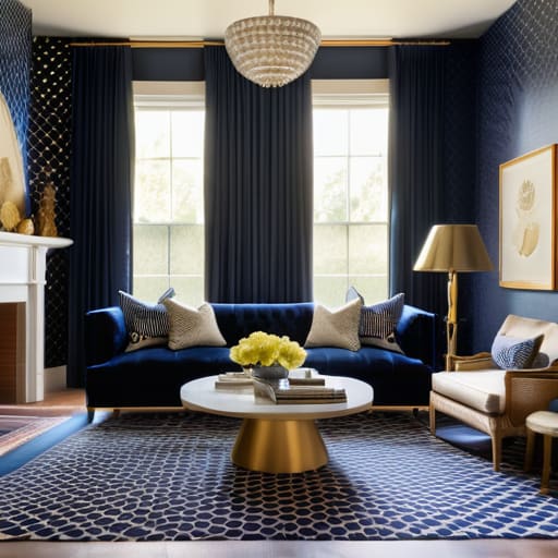
I remember standing in the middle of my first apartment in San Francisco, surrounded by half-unpacked boxes and a crushing sense of overwhelm. I had this beautiful, oversized botanical print rug, but every time I tried to add a cushion or a throw, the whole space felt like it was shouting at me rather than inviting me in. I spent hours scrolling through sterile design blogs, feeling like I needed a degree in fine arts just to figure out how to mix patterns in a room without it looking like a chaotic thrift store explosion. It was exhausting, and frankly, it felt completely disconnected from the sense of peace I was actually trying to cultivate in my home.
I’m not here to give you a list of rigid, intimidating rules that strip the soul out of your space. Instead, I want to share the gentle, evidence-based approach I’ve refined through years of studying how our environments impact our mental well-being. We are going to explore how to mix patterns in a room by focusing on rhythm, scale, and intention, turning your living space into a true sanctuary. This isn’t about perfection; it’s about finding a visual harmony that allows you to finally exhale the moment you walk through the door.
Table of Contents
Finding Harmony Through Mixing Geometric and Floral Prints
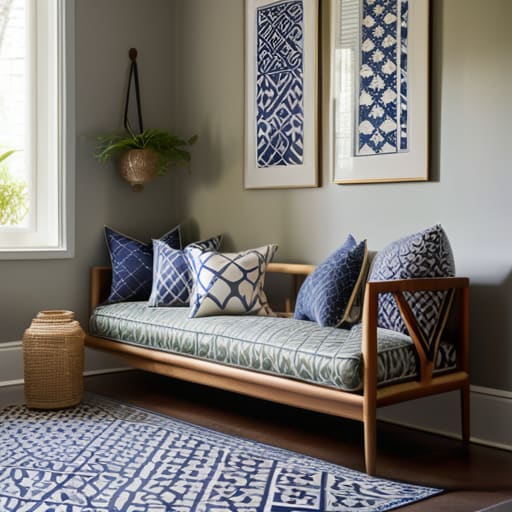
I remember sitting in my first tiny apartment in San Francisco, surrounded by mismatched pillows and feeling like my space was screaming at me rather than hugging me. I was terrified that adding a bold floral rug would clash with my favorite striped cushions, but that’s where the magic happens. When you’re mixing geometric and floral prints, you’re essentially balancing the structured logic of the mind with the wild, flowing beauty of nature. Think of the geometric shapes as the steady heartbeat of the room—providing rhythm and order—while the florals act as the soulful, expressive melody that brings the space to life.
To keep this dance from turning into chaos, I always suggest looking at the visual weight of patterns. If you have a large-scale, dramatic botanical print on your sofa, pair it with a smaller, more subtle geometric print on your throw pillows. This prevents any single element from overwhelming your senses. I also love using neutral anchor elements in decor, like a soft linen slipcover or a simple jute rug, to give your eyes a place to rest. It’s all about creating a sanctuary where every texture feels intentional and every pattern feels like it belongs.
Using Neutral Anchor Elements in Decor to Breathe
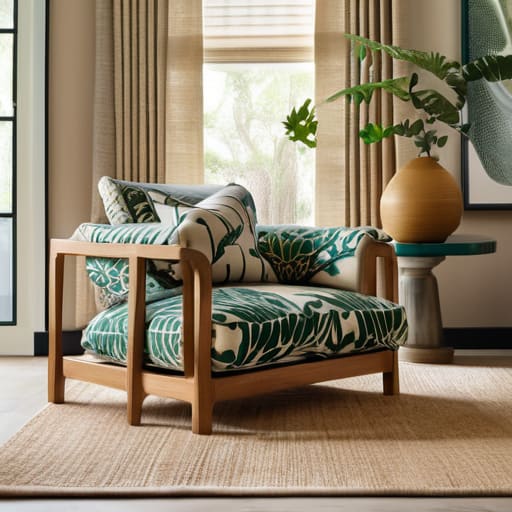
When we dive into the excitement of bold prints, it’s easy to let the energy of a room spiral into something that feels more chaotic than calming. I remember my first attempt at a maximalist living room; I was so caught up in the thrill of the patterns that I forgot to give my eyes a place to rest. That’s where neutral anchor elements in decor become your best friend. Think of them as the steady, grounding breath in the middle of a fast-paced conversation. By incorporating solid-colored furniture, linen curtains, or even a simple jute rug, you create a “buffer zone” that allows your more adventurous pieces to truly shine without overwhelming your senses.
Understanding the visual weight of patterns is key here. If you have a heavy, dark botanical print on your sofa, balancing it with light, airy neutrals prevents the space from feeling claustrophobic. It’s about creating a sense of equilibrium, much like finding balance in our daily routines. When you use these neutral foundations, you aren’t just decorating; you’re practicing a form of cohesive room styling that invites stillness into your sanctuary.
The Soul of the Space: 5 Intentional Ways to Layer Patterns
- Play with scale to create a sense of visual breathing room; if you pair a large, sweeping botanical print with a tiny, intricate geometric, you prevent the eye from feeling overwhelmed and allow each pattern to find its own rhythm.
- Let color be your common thread, acting like a gentle guiding light that connects disparate designs; when your patterns share a similar tonal family, the room feels cohesive and calm rather than chaotic.
- Use the “Rule of Three” to build depth, layering a bold statement pattern, a subtle secondary motif, and a textured solid to create a sanctuary that feels curated and intentional.
- Don’t be afraid to introduce organic textures—like a chunky jute rug or a linen cushion—to soften the edges of sharp prints, much like how a little mindfulness helps soften the edges of a hectic workday.
- Trust your intuition when it comes to the “vibe” of the room; if a combination feels too loud, step back, take a deep breath, and swap one piece for something more understated until the space feels like it’s finally exhaling.
Embracing the Rhythm of Your Space
Treat pattern mixing like a mindful practice; instead of rushing to fill every corner, allow your eyes to rest on neutral anchors so each print has the breathing room it needs to truly sing.
Look for the common thread—whether it’s a shared color palette or a similar scale—to create a sense of visual flow that feels intentional rather than chaotic.
Trust your intuition over rigid rules; your home should be a reflection of your inner landscape, so if a combination feels soulful and brings you peace, it’s exactly where it belongs.
## The Soul of a Space
“Mixing patterns isn’t about following a rigid set of rules; it’s about finding a rhythmic dance between different energies—allowing a bold geometric to provide structure while letting a soft floral bring the breath and movement that makes a room truly feel alive.”
Sophia Reynolds
Creating Your Personal Sanctuary
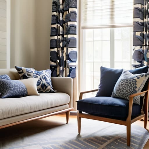
As we wrap up this journey of textures and tones, remember that mixing patterns isn’t about following a rigid set of rules; it’s about finding a sense of equilibrium. We’ve explored how the structured energy of geometric prints can find peace when paired with the organic softness of florals, and how those essential neutral anchors act as the quiet breath your room needs to avoid feeling overwhelmed. By balancing scale, color, and rhythm, you aren’t just decorating a space—you are intentionally curating an environment that supports your mental well-being and reflects your unique inner landscape.
At the end of the day, your home should be a reflection of your soul, not a showroom floor. Don’t be afraid to experiment, to stumble, or to change your mind as you learn what truly resonates with you. Decorating is a mindful practice, a way to pause and listen to what your space is asking for. Trust your intuition, let your creativity flow, and remember that the most beautiful rooms are those that feel deeply lived-in and authentically yours. You have the power to turn any four walls into a sanctuary of harmony and joy.
Frequently Asked Questions
I love the idea of mixing patterns, but how do I know when I've gone too far and my space starts feeling more chaotic than cozy?
That is such a valid concern! I remember when I first tried this in my old apartment—I ended up with a space that felt more like a frantic puzzle than a sanctuary. My rule of thumb? Check in with your nervous system. If you walk into a room and feel a sense of visual “noise” that makes you want to rush out, you’ve likely crossed the line. Trust that intuitive pause; if it doesn’t feel peaceful, scale back.
If I'm working with a very small room, are there specific types of patterns that might make the space feel cramped instead of intentional?
When you’re working with a smaller footprint, it’s so easy to feel overwhelmed by visual noise. I’ve found that large-scale, high-contrast patterns—think bold, chunky geometrics or heavy, dark florals—can act like visual barriers, making the walls feel like they’re closing in. Instead, try leaning into smaller, more delicate scales or soft, watercolor-style prints. They offer a sense of intention without demanding too much “breathing room,” keeping your sanctuary feeling airy and light.
How can I use color to tie different patterns together if the prints themselves feel like they belong to completely different worlds?
Think of color as the common thread that weaves your space together. When patterns feel like they’re from different universes, find one shared hue—even if it’s just a tiny accent in a print—and repeat it through pillows, throws, or even a piece of art. It’s like finding a familiar friend in a crowded room; that single, consistent color creates a sense of visual belonging, allowing the different textures to finally exhale and coexist in harmony.