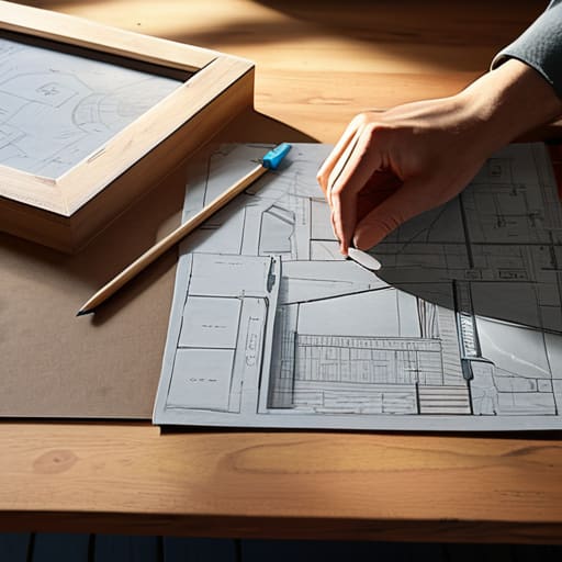
I still remember my first weekend at the local farmers’ market in my hometown back in Oregon. I had spent weeks obsessing over every tiny detail, convinced that if I just bought the most expensive tiered shelving and the trendiest linen tablecloths, I’d be an instant success. Instead, I stood there behind a cluttered, claustrophobic mess of products, feeling completely disconnected from the people walking by. I realized then that most advice on how to plan a market stall layout focuses way too much on the “aesthetic” and not nearly enough on the human connection. You don’t need a massive budget or a degree in interior design to create a space that works; you just need to understand the energy of your flow.
In this guide, I’m stripping away the fluff and the expensive “must-have” lists that most gurus try to sell you. I want to share a more intentional, grounded approach to designing your space—one that prioritizes ease and accessibility for both you and your customers. We’re going to dive into how to plan a market stall layout that feels as natural as a deep breath, ensuring your setup invites people in rather than pushing them away.
Table of Contents
- Mastering Visual Merchandising for Markets With Grace
- Maximizing Small Stall Space for a Balanced Flow
- Cultivating Connection: 5 Intentional Ways to Design Your Market Experience
- Bringing It All Together: Your Intentional Market Blueprint
- Designing with Intention
- Creating Space for Connection and Growth
- Frequently Asked Questions
Mastering Visual Merchandising for Markets With Grace
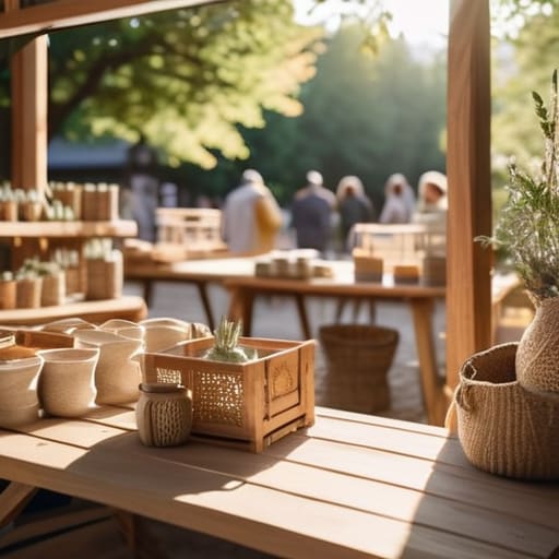
When we talk about visual merchandising for markets, I like to think of it less as “selling” and more as storytelling through space. I remember my first pop-up in a tiny corner of a local fair; I was so focused on cramming every single item onto the table that I actually made it harder for people to connect with my work. Instead of a cluttered mess, try to view your setup as a curated journey. By understanding customer foot traffic patterns, you can position your “hero” products—those special pieces that truly capture your soul—in a way that naturally draws people in from the aisle without feeling aggressive.
One of my favorite little secrets from my corporate wellness days is the concept of “flow,” which applies beautifully to retail display ergonomics. You want to create a sense of ease for your visitors. This means being mindful of merchandise eye level placement; if your best items are tucked away at waist height, they might never get the love they deserve. Aim to create layers of height and texture, which helps in maximizing small stall space while keeping the energy of your booth feeling light, intentional, and inviting.
Maximizing Small Stall Space for a Balanced Flow
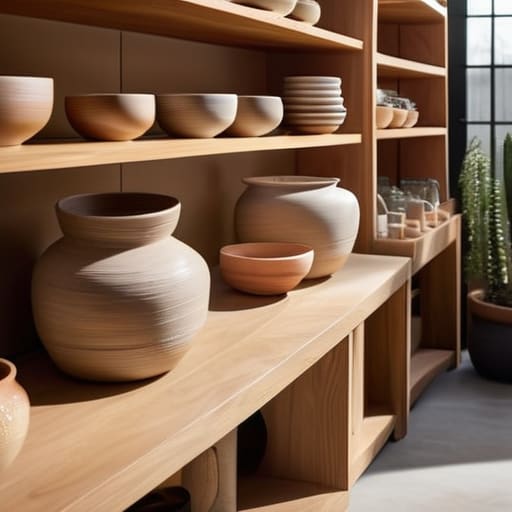
When we’re working with limited square footage, it’s so easy to feel a sense of claustrophobia—not just physically, but mentally too. I remember my first small pop-up in a tiny corner of a Portland market; I felt so overwhelmed by the clutter that I could barely breathe, let alone connect with my customers. The secret to maximizing small stall space isn’t about cramming more products into every inch; it’s about creating breathing room. Think of your stall like a sanctuary. By utilizing verticality and keeping your surfaces intentional, you prevent that frantic energy that often pushes people away.
To keep things feeling calm and inviting, I always suggest focusing on retail display ergonomics. You want your most captivating pieces positioned at merchandise eye level placement so that customers don’t have to strain or hunt to find your treasures. When you respect the natural movement of the body, you actually influence customer foot traffic patterns, encouraging people to linger rather than just pass through. It’s all about creating a rhythmic, easy flow that feels as effortless as a slow exhale.
Cultivating Connection: 5 Intentional Ways to Design Your Market Experience
- Design a “Welcome Zone” that invites a gentle pause. Instead of crowding your entrance with high-pressure sales items, leave a little breathing room at the front of your stall. This creates a psychological “buffer zone” that allows customers to transition from the busy market aisle into your unique world without feeling overwhelmed.
- Use height to create a sense of rhythm. Just like we use different levels of breath in yoga to find balance, your stall needs visual levels. Use crates, risers, or even vintage books to lift some products up and let others rest low. This prevents the “flatness” that can make a space feel stagnant and encourages the eye to dance naturally across your offerings.
- Curate “Storytelling Clusters” rather than rows. Instead of lining everything up like a grocery store shelf, group items by the feeling or lifestyle they evoke. When you group a hand-poured candle with a linen journal, you aren’t just selling products; you’re inviting the customer to visualize a cozy, mindful morning. It makes the shopping experience feel more like a discovery and less like a transaction.
- Mind your sensory landscape. We often forget that a layout isn’t just about what we see. Think about where your scent-heavy items are placed so they don’t overwhelm the space, or where a soft textile might tempt a customer to reach out and touch. A layout that engages touch and smell creates a grounded, immersive environment that keeps people lingering.
- Prioritize your own “Zen Station.” It sounds simple, but if your layout leaves you feeling cramped or disorganized, that stress will radiate to your customers. Ensure you have a small, tucked-away spot for your water, your notes, and a moment to reset. When you move through your stall with ease and grace, your customers will subconsciously mirror that calm energy.
Bringing It All Together: Your Intentional Market Blueprint
Remember that your stall is more than just a place to sell; it’s an invitation. When you design with intention and focus on a natural flow, you create a space where customers feel invited to linger rather than rushed to leave.
Don’t let the pressure of a small footprint overwhelm you. By prioritizing your most meaningful items and embracing a “less is more” philosophy, you can turn limited square footage into a curated experience that feels both abundant and organized.
Trust your intuition as much as your layout. While visual merchandising is key, the most successful stalls are those that reflect the maker’s energy, allowing your passion to shine through the physical arrangement of your beautiful goods.
Designing with Intention
“Think of your market stall not just as a place of transaction, but as a curated sanctuary; when you design your layout with intention and ease, you aren’t just displaying products—you’re inviting people to slow down, breathe, and truly connect with what you’ve created.”
Sophia Reynolds
Creating Space for Connection and Growth
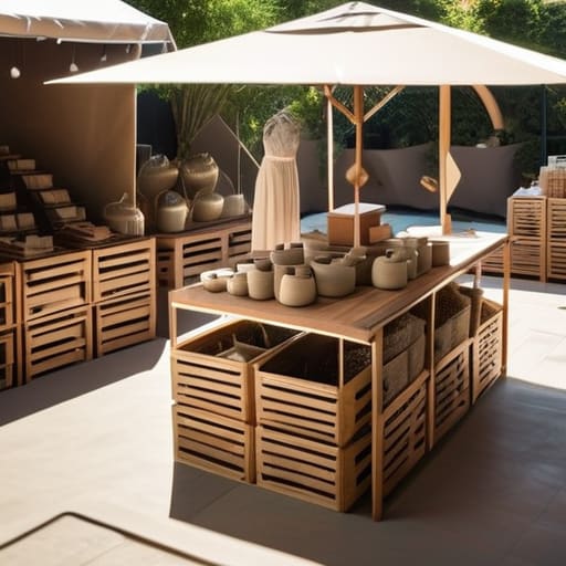
As we wrap up our journey through the intricacies of stall design, I hope you feel more equipped to approach your next market day with a sense of clarity. Remember, it isn’t just about where you place your products; it’s about how those choices influence the energy of your space. By mastering the art of visual merchandising and being intentional with every inch of your small footprint, you aren’t just organizing inventory—you are curating an experience. When you prioritize a balanced flow and a layout that feels intuitive, you create a sanctuary where customers feel invited to linger, rather than just pass through.
Ultimately, I want you to remember that your market stall is a beautiful reflection of your passion and your hard work. There will be days when the wind blows your displays askew or the crowd feels overwhelming, but don’t let that shake your foundation. Take a deep breath, center yourself, and remember that intentionality is your greatest superpower. Whether you are selling handmade ceramics or organic honey, your presence is what truly breathes life into your booth. Go out there, trust your creative instincts, and build a space that allows both your business and your spirit to truly flourish.
Frequently Asked Questions
How can I keep my stall from feeling cluttered and overwhelming for customers while still displaying all my beautiful products?
Think of your stall like a curated sanctuary rather than a storage unit. To prevent that overwhelming “clutter” feeling, try the “Rule of Three”—grouping items in odd numbers to create natural visual resting points. Leave intentional “white space” between collections; it gives your customers’ eyes permission to breathe. When we stop trying to show everything at once, we actually allow each beautiful piece to tell its own story.
Is there a way to design my layout so that I can stay present and mindful with my shoppers without feeling trapped behind a table?
I completely hear you—that “barrier” feeling is so real. When we hide behind a heavy table, we unintentionally create a wall between ourselves and the community we’re trying to connect with. Try experimenting with a “U-shaped” layout or even a semi-open front. By stepping slightly into your space, you invite shoppers into your world rather than just presenting a storefront. It turns a transaction into a genuine, mindful connection.
How do I decide which items should be at eye level to create a sense of natural connection and ease for people walking by?
Think of your eye-level products as the “warm welcome” of your stall. I always suggest placing your most soulful, storytelling pieces there—the ones that immediately spark a connection or a sense of wonder. When someone glances your way, you want to meet their gaze with something meaningful, not just something bulky. It’s about creating a gentle invitation to pause, rather than overwhelming them with a wall of stuff. Let your heart lead the placement.