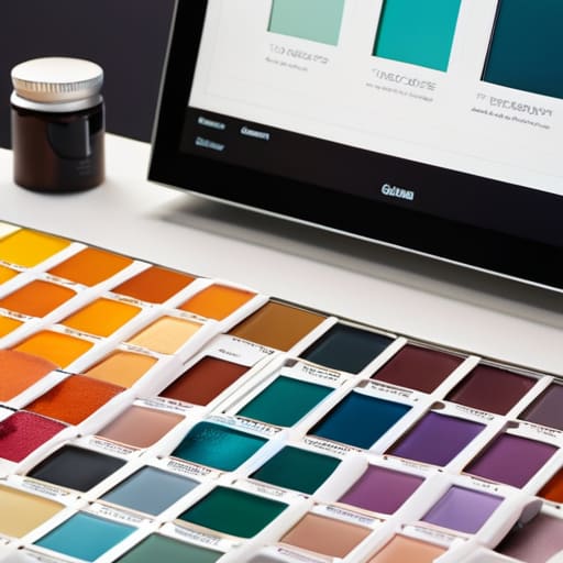
I still remember sitting on my floor in my tiny first apartment after a grueling ten-hour shift, surrounded by a chaotic sea of paint swatches, fabric scraps, and half-finished design mood boards. I felt completely paralyzed, staring at the mess and wondering why I couldn’t just organize my creativity. I had spent so much money on high-end planners and expensive digital tools, yet I still lacked a functional way to manage my palette. I realized then that most advice on how to keep a colour reference system is either way too rigid or unnecessarily complicated, leaving you feeling more overwhelmed than inspired.
I’m not here to sell you on a complex, soul-crushing filing method that requires three hours of maintenance every week. Instead, I want to share the gentle, sustainable strategies I’ve gathered from years of balancing high-pressure corporate projects with my own creative pursuits. We are going to explore how to build a system that actually breathes with you, turning your color organization from a source of stress into a sanctuary of clarity. Let’s find a way to keep your inspiration flowing without losing your peace of mind.
Table of Contents
- Standardizing Colour Measurement for a More Intentional Workspace
- Nurturing Digital Colour Calibration Through Mindful Daily Rituals
- Five Gentle Rhythms for Maintaining Your Color Harmony
- Embracing Color with Intention and Ease
- Finding Harmony in the Details
- Finding Harmony in the Hue
- Frequently Asked Questions
Standardizing Colour Measurement for a More Intentional Workspace
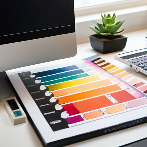
When I was working as a corporate wellness consultant, I noticed how much mental fatigue stems from “visual friction”—that tiny, nagging feeling when the colors on your screen don’t match the physical samples on your desk. It’s a subtle drain on your cognitive energy. To combat this, I’ve found that standardizing colour measurement isn’t just a technical task; it’s an act of self-care for your creative mind. By establishing a consistent baseline, you remove the guesswork and the frustration of “close enough,” allowing you to move through your projects with a sense of flow rather than constant correction.
I always suggest integrating a simple digital colour calibration step into your morning ritual. Think of it like centering yourself before a yoga session; it aligns your tools so your vision remains true. Whether you’re working with digital assets or physical pigments, setting these intentional guardrails ensures that your workspace remains a sanctuary of accuracy rather than a source of chaos. When your environment is predictable and precise, your brain is finally free to focus on what truly matters: the joy of creation.
Nurturing Digital Colour Calibration Through Mindful Daily Rituals
I remember back when I was consulting for a high-pressure design firm in San Francisco, I noticed how many creatives felt a sense of rising anxiety every time their screens looked “off.” It wasn’t just a technical glitch; it was a disruption of their creative flow. I’ve learned that digital colour calibration shouldn’t feel like a chore on a daunting to-do list. Instead, try weaving it into your morning ritual. Just as I start my day with a few minutes of deep breathing and a warm cup of matcha, you can treat your calibration process as a moment of grounding. Setting your monitor to its true north before you dive into deep work creates a sense of digital sanctuary, ensuring that what you see is exactly what you intended to create.
When we integrate these small, intentional checks into our colour management workflow, we aren’t just maintaining equipment; we are honoring our creative vision. Think of it as a way of practicing self-care for your craft. By dedicating just five minutes to ensuring your display is accurate, you reduce the mental friction of second-guessing your hues later in the day. It’s about building a foundation of trust between your eyes and your tools, allowing you to work with a sense of unshakeable confidence.
Five Gentle Rhythms for Maintaining Your Color Harmony
- Create a “Color Check-in” ritual. Just like we check in with our breath during a yoga flow, take five minutes every Monday morning to review your palette. It prevents that overwhelming feeling of chaos from creeping in when your visual tools start to drift.
- Honor your physical tools with a dedicated sanctuary. If you use physical swatches or Pantone books, don’t just toss them in a drawer; give them a beautiful, organized home. When your tools are treated with respect, you’ll find yourself more inclined to maintain their precision.
- Practice the art of “Visual Decluttering.” Every few months, I like to go through my digital color libraries and prune anything that no longer resonates with my current creative energy. A streamlined system is a peaceful system.
- Document your “Why” alongside your “What.” When you update a hex code or a swatch, jot down a tiny note about why that specific shade matters to your current project. This adds a layer of intention to your technical organization, turning a chore into a moment of reflection.
- Trust the ebb and flow of your environment. Remember that lighting changes with the seasons—the golden light of an Oregon summer is nothing like a moody California winter. Adjust your reference system to account for these natural shifts rather than fighting against them.
Embracing Color with Intention and Ease
View your color system not as a rigid chore, but as a way to create a sense of visual harmony and calm in your creative environment.
Make digital calibration a small, soothing ritual in your workday—think of it as a way to clear the mental fog and ground yourself in accuracy.
Remember that consistency is a form of self-care; by standardizing your references, you’re reducing decision fatigue and freeing up mental space for what truly matters.
Finding Harmony in the Details
“Maintaining a color reference system isn’t just about technical precision; it’s about creating a reliable visual anchor that allows your creative intuition to flow without the friction of doubt.”
Sophia Reynolds
Finding Harmony in the Hue
As we wrap up our journey through the technical and mindful aspects of color management, I hope you see that maintaining a color reference system is about so much more than just avoiding a mismatch between your screen and your printout. By standardizing your measurements and weaving digital calibration into your daily mindfulness rituals, you aren’t just managing data—you are actively reducing the cognitive load that comes with visual inconsistency. When we take the time to ground our workspace in these small, intentional habits, we create a stable foundation that allows our creativity to flourish without the constant, nagging distraction of technical uncertainty. It truly is about cultivating a sense of visual clarity that mirrors the mental clarity we strive for in our personal lives.
At the end of the day, remember that your tools and your systems should serve your well-being, not add to your stress. Whether you are a designer, an artist, or someone simply looking to bring more intentionality to your digital environment, treat your color system as a form of self-care for your creative soul. When we align our external environment with our internal standards, we find a beautiful rhythm where work feels less like a struggle and more like a flow. So, take a deep breath, trust your eye, and remember that true productivity begins with a moment of pause and a commitment to doing things with intention. You’ve got this!
Frequently Asked Questions
How can I maintain a consistent color system without it feeling like just another overwhelming chore on my to-do list?
I totally get that feeling—when a helpful system starts feeling like a heavy weight on your shoulders, it’s time to shift your perspective. Instead of seeing color maintenance as a “task,” try weaving it into your existing flow. Maybe it’s a five-minute “color check” alongside your morning coffee, or a quick calibration ritual right before you dive into deep work. When we turn maintenance into a mindful transition rather than a chore, it actually becomes a grounding moment of clarity.
What are some gentle ways to audit my color palettes periodically to ensure they still align with my current creative energy?
Think of your palette as a living reflection of your inner landscape. To audit it gently, try a “color meditation”: sit quietly with your current swatches and notice if any hues feel heavy or dissonant. If a shade feels like a chore to use, it’s likely out of sync with your current energy. Instead of a harsh overhaul, just introduce one “soul-nourishing” accent color to see how it breathes new life into your flow.
Are there specific physical tools or sensory cues I can use to keep my color references organized in a way that feels calming rather than cluttered?
I love this question because it shifts the focus from mere “organization” to creating a sanctuary. Instead of a chaotic drawer of swatches, try using tactile tools like linen-bound color books or weighted wooden palettes. These add a grounding, sensory element to your workflow. I also find that organizing by “mood gradients” rather than strict codes can turn a cluttered desk into a visual breathing space, helping you feel inspired rather than overwhelmed.