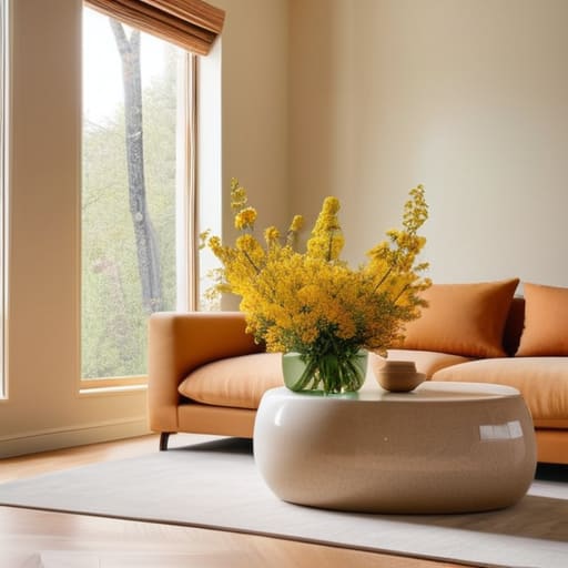
I remember sitting in my old cubicle back in my corporate days, staring at those soul-crushing, beige walls until my eyes actually ached. I felt like my creativity was being slowly suffocated by a sea of “professional” neutrals, and no amount of overpriced aromatherapy could fix that heavy, stagnant feeling in my chest. I realized then that we often overlook the most immediate tool we have for emotional regulation: our visual environment. Learning how to use colour to lift a mood isn’t about following some expensive interior design trend or repainting your entire life in neon; it’s about understanding the subtle psychological shifts that happen when we intentionally invite light and pigment into our personal sanctuaries.
In this space, I’m not going to sell you on some magical, overnight transformation or tell you that a single yellow pillow will solve all your problems. Instead, I want to share the evidence-based, practical ways you can weave intentional hues into your daily rhythm to foster genuine resilience. We’re going to explore how to curate a palette that supports your mental clarity and peace, moving away from the hype and toward meaningful, mindful living.
Table of Contents
- The Gentle Embrace Colour Therapy for Anxiety Relief
- The Psychological Effects of Blue and Yellow
- Small Shifts, Big Soul: My Favorite Ways to Invite Color into Your Daily Flow
- Bringing the Harmony Home: Your Color Toolkit
- ## The Living Canvas of Our Wellbeing
- Painting Your Path to Peace
- Frequently Asked Questions
The Gentle Embrace Colour Therapy for Anxiety Relief
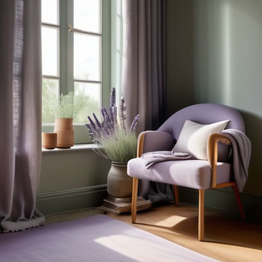
I remember a particularly frantic season during my time as a corporate consultant; my mind felt like a browser with fifty tabs open, all playing different music at once. When the world feels too loud, I’ve found that leaning into colour therapy for anxiety relief can act like a soft exhale for your nervous system. Instead of fighting the chaos, we can use our environment to anchor us. I often suggest turning to the softer side of the spectrum—think sage greens or dusty lavenders—to create a sanctuary that feels safe and grounded.
There is something deeply restorative about the psychological effects of blue and yellow when used with intention. While a soft, sky blue can mimic the calming expanse of the horizon to lower your heart rate, a whisper of pale primrose can prevent that calm from turning into lethargy. It’s about finding that sweet spot where your space doesn’t just look beautiful, but actually holds space for your peace. By choosing hues that soothe rather than stimulate, we aren’t just decorating; we are actively crafting a refuge for our souls.
The Psychological Effects of Blue and Yellow
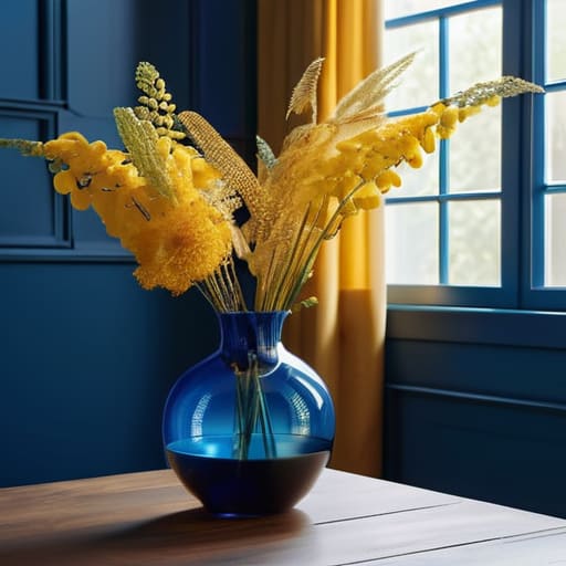
Now, let’s dive into two of my absolute favorites when it comes to shifting our internal landscape: blue and yellow. I remember during my time as a corporate wellness consultant, I noticed how a sudden shift in a workspace’s palette could completely change the “vibe” of a meeting. Blue is like a deep, calming exhale; it’s scientifically linked to lowering heart rates and fostering a sense of stability. When we look at the psychological effects of blue and yellow, we see a beautiful dance between stillness and vitality. Blue invites us to find our center, making it a cornerstone of colour therapy for anxiety relief.
On the flip side, if you’re feeling a bit stuck in a mid-afternoon slump, yellow is your best friend. It’s like a burst of morning sunlight streaming through a window. While blue settles us, yellow is all about using colour to boost energy levels and spark creativity. It taps into that sense of joy and mental clarity we all crave. I love experimenting with optimistic colour schemes for home that blend these two—perhaps a soft, serene blue bedroom paired with a sunny, mustard-toned reading nook—to create a space that truly breathes with you.
Small Shifts, Big Soul: My Favorite Ways to Invite Color into Your Daily Flow
- Curate your “Focus Corner” with soft greens. I remember when I was drowning in corporate spreadsheets, I added a few lush pothos plants to my desk. That gentle, organic green didn’t just look pretty; it acted like a visual deep breath, grounding me whenever my mind started to race.
- Let’s play with “Dopamine Decor” in your small spaces. You don’t need to repaint a whole room—try a bright coral candle or a sunny ochre throw pillow. These little pops of warmth act like tiny, unexpected hugs for your senses when you walk into a room.
- Use color to anchor your morning ritual. If you’re feeling a bit sluggish, try sipping your morning tea from a vibrant orange mug. It sounds simple, almost whimsical, but that burst of citrusy energy can help nudge your brain out of its morning fog and into a more proactive headspace.
- Create a “Sunset Sanctuary” in your bedroom. As we wind down, we want to move away from high-energy tones. I love using soft terracottas or dusty rose accents in the evening; they mimic that beautiful, calming transition of twilight, signaling to your nervous system that it’s finally okay to let go.
- Don’t forget the power of your digital palette. We spend so much time staring at screens, so why not make them work for you? Switching your phone or desktop wallpaper to a soothing lavender or a soft sky blue can provide a micro-moment of mindfulness every single time you check a notification.
Bringing the Harmony Home: Your Color Toolkit
Remember that color isn’t just a visual experience; it’s an emotional one. When you feel your energy dipping, don’t just reach for more caffeine—try reaching for a splash of warmth or a calming shade of blue to reset your internal rhythm.
Create intentional “micro-sanctuaries” in your home or workspace. You don’t need a full renovation to feel the shift; even a single yellow candle or a soft teal cushion can serve as a gentle anchor for your mood during a hectic workday.
Listen to your intuition above all else. While research gives us a wonderful roadmap, the most powerful color is the one that makes your soul feel at peace. If a certain hue feels heavy to you, trust that feeling and pivot toward what brings you light.
## The Living Canvas of Our Wellbeing
“We often forget that our surroundings aren’t just static spaces; they are living, breathing extensions of our internal world. When we intentionally invite a soft sage or a warm sunset hue into our lives, we aren’t just decorating a room—we are gently whispering to our nervous system that it is safe to exhale and truly belong.”
Sophia Reynolds
Painting Your Path to Peace
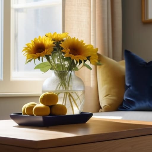
As we wrap up our journey through the spectrum, I hope you can see that color is so much more than just a visual experience; it is a profound tool for emotional regulation. Whether you are leaning into the calming, meditative depths of blue to soothe a racing mind, or inviting the gentle, sun-drenched optimism of yellow to spark a little joy on a cloudy afternoon, you are essentially curating your internal environment. Remember, using color for wellness isn’t about creating a perfect, Pinterest-worthy home; it’s about making intentional choices that honor your current emotional needs and provide a soft place for your spirit to land.
I want to leave you with a small thought to carry into your week: your space is an extension of your soul. In the hustle and bustle of our modern lives, it is so easy to forget that we have the agency to shift our energy simply by changing our surroundings. Don’t feel like you need to repaint your entire life overnight—start small. Perhaps it’s a single bright candle, a soft teal throw blanket, or even just a mindful moment spent admiring the sunset. Listen to what your heart is craving, and let color be the gentle guide that helps you navigate back to yourself. You deserve a life that feels as vibrant and balanced as you are.
Frequently Asked Questions
Can I use these color techniques in my workspace without making my entire office feel overwhelming or distracting?
Oh, I hear you! I remember when I was transitioning out of my corporate role, my office felt like a chaotic storm of sensory overload. You don’t need to repaint every wall to feel the shift. Think of color as a seasoning, not the main course. Try incorporating small, intentional accents—a calming sage desk organizer or a soft amber lamp. It’s about those gentle, strategic nudges that ground you without stealing your focus.
How do I balance using "energizing" colors for productivity with the need to stay calm and avoid burnout?
I completely hear you—it’s that delicate dance between wanting to crush your to-do list and needing to keep your nervous system steady. I used to struggle with this in my corporate days! I’ve found that “zoning” is your best friend. Use those fiery reds or bright yellows in small, intentional pops—maybe a desk accessory—to spark focus, but keep your primary visual field in those soft, grounding neutrals or calming greens. It’s all about intentionality, not intensity.
Are there specific ways to incorporate these colors through small, easy changes like lighting or plants if I can't repaint my walls?
Oh, I hear you! When I was working those intense corporate hours in Cali, I definitely didn’t have the bandwidth (or the landlord’s permission!) to repaint my entire apartment. You don’t need a sledgehammer to shift your energy. Try swapping a harsh bulb for a warm, amber light to mimic sunset hues, or bring in a lush, leafy plant to ground your space. Even a simple yellow ceramic mug can be a tiny, bright anchor for your morning ritual.